Tuesday, 24 April 2012

Friday, 2 March 2012


The moodboard which i created gives a rock n roll mood becuase of the colour scheme and the majory rock bands.  I have done this becuase the genre of my music magazine is based around rock n roll.  I have a dark background around the pictures which is contrasting with the black colour.  The colour of the text is maily red, black and white, i have intended this becuase it is basic colours which link into rock text.  The skull images has been used in a few images, this links into the rock n roll mood becuase rock n roll normally has a deathly/danger mood to it.  I have used rock intruments becuase it links in with the rock n roll feeling. 

Luke Hignett
  

Wednesday, 22 February 2012

Photoshoot plan

This weekend I am going to produce my photoshoot.  It will include the appropriate mise-en-scene, costume and props for the specific genre.

The person I am going to photograph is a female family relation.  She is suited to the indie genre which is the genre of the magazine.  She can play the guitar and looks like a convincing artist.

The mise-en-scene is going to be in a field, I chosen this because i will get the natural lighting which I need.  She is going to be dressed in a white flower power dress.  The props is going to be a acoustic guitar, I have done this to suit in with the indie genre.

The amount of photo I will take will most likely be between 10-15, I have chosen this amount because I will be able to select a wide range a different photos to chose from.  I will be editing most of my photos using Photoshop.

Luke Hignett           

Tuesday, 21 February 2012

My Genre Choice

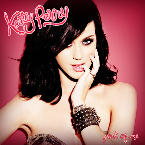
I have decided that the genre of my magazine will be pop and indie genre of music.  I have selected this genre because I enjoy the music and will find it easy to talk about it in my double page spread and make a front cover.  Here are some artists and bands that influence my magazine.   

Katy Perry:


Pixie Lott: 

Rita Ora: 

Arctic Monkeys:
 

Analysis Of Music Magazine Front Cover


These two magazines are Spins and Blender.  There is a big similarity between the images used as they affect the target audience of the magazine.  The main similarity between the images used is the male gaze theory.  Both magazines use attractive women as "eye candy" for male audiences.  However looking at the magazine their main target audience is women.  This is clearly shown by the neat house style, identifable women and the text used.  The colours on the Blender magazine are pink and black, these colour contrast well and are based towards women because they are plain colours.  The Blender magazine also lists topics which will attract female attention, women are presented as wanting to know gossip about celebrities and on the cover it says "Kiss n tell", which is their version of a interview were Katy Perry will say information about her life.  Another topics which Blender has listed is a celebrity quote.  This quote will attract audiences because it is personal topic towards a celebrity.  

The Spin magazine uses some of the same features as Blender but in different ways.  Spin has put a quote on their front cover, but it is more agressive than the Blender one.  This quote expresses Haley Williams views about women, which other women will enjoy reading about.  

The moral panic theory is used on both these magazines.  On Blender it mentions about "porn", which an example of moral panic because it is a adult concept and children might notice it.  On Spin it has two examples of moral panic. The first one is the quote from Hayley Williams, she is saying that these women are wrong and therefore it is classed as a fork devil.  The second example is the "throw down" this is an agressive term and is therefore an example of moral panic.    

Friday, 10 February 2012

Preliminary Task


This is a mock up for my preliminary front cover college magazine task.  As shown on the image I have put the masthead at the top of the page.  This is a typical magazine convention and I wanted the stick with this convention because it looks professional and neat.  The masthead will have a blue box with in text quoting "Deyes High School", the "Deyes" will be red, the "High" will be a stronger blue than the background and the "School" will again be red, I will do this because it makes it look more appealing as it is more colourful.  The size of this font will be 36, as the viewer will need to recognise it and know the name.  The text style will be Time New Roman as it looks professional and is easily readable.  In the top right of the cover I will put the Deyes High School logo, this makes the newsletter more professional because it has its own logo and therefore makes it unique, the image size will be large as the viewer will recognise it and know the school.  Below the masthead I will put the date and issue on the cover, this is a cover convention because the viewer will want to know which issue it is, so that they can discuss it.  Further down I will have a title quoting "@deyesbuilding", this title is the main news of the magazine and there will be a piece of text and an image below explaining about the building.  The title will be size 36 as it is the main topic and needs to be noticed.  The text style will be Times New Roman to make the cover look professional and neat.  The image below will be the image of the @Deyesbuilding, this is to match will the title and the text, the image will be large as it makes the cover look more appealing and so that the viewers will know what the building looks like.  The text next to the image will be a short summary about the title and image, It will explain about it and why the school built it.  The text size will be 16 as it will be easy to read at wont take up space on the cover.  The text style will be Times New Roman as it makes the cover look more professional and neat.  At the bottom of the page I will have an image of Deyes High Students celebrating their results, this makes the school more professionally as they are celebrating their achievements and the school is praising them for it.  The image size will be medium as it wont clash with the main article of the newsletter.  There will be a pug above the image will draw in the viewers, it will have intriguing text which will make the viewer want to read inside.  The text at the bottom will the contact information of the school, this is so that parents or viewers can contact the school if they want more details or information about it.  I will keep the background of the cover white as the colours wont clash with each other and it makes the cover look more professional.

Finished Newsletter Cover   

Here is my finished Preliminary task cover.  I have kept to most of my mock up but have made some changes.  On the changes I have made is the pug.  I didn't use the pug because the image couldn't fit on the cover and go in a neat set out.  Instead of using a pug I made the image bigger and added a piece of text explaining the image.  This text explains in more detail about the image and makes it more clear to the viewers.  I feel this is an improvement because it makes the cover look neater and adds more details to it.